Shortly after photographing my newly acquired G-Force clothing in December 1981, I commenced a renovation of my bedroom. As with most teenagers, this room was an enclave, and I decorated it as a shrine to reflect my interests in subcultures and ‘looking right’. I did not have carte blanche to do whatever I wanted to my room and was jealous of other schoolfriends who went all-out to create punk dens. There always seemed to be someone who painted their bedroom black. But that was not me. Instead, I turned to the ample imagery in newspapers and magazines as the deliberately dour iconology of post-punk slowly morphed into the pantomime splendour of new-pop. It dazzled me, and I was in a perpetual state of being a hostage to the imagery of pop music.
The walls of the bedroom were in standard woodchip wallpaper painted a middle blue colour. My intention was to create a brick wall effect of cut out newspaper images drawn from NME and Sounds. I was looking for photographs of bands and artists that aspired towards a look, the look I might myself aspire to. By the early 80s, photography in these newspapers was an art in itself, and bands often looked good or were photographed in a way to make them look good.
This moment of having a great look was quickly evolving towards a contrived and complete image to play the new-pop game: Orange Juice as superannuated boy scouts, Dexys as rural ragamuffin tinkers, ABC as a landed gentry shooting-party (their third image overhaul in the space of three singles), Heaven 17 as city bankers. The critic John A. Walker explores the aspirational collaboration between pop, art and image in his 1987 book Cross-Overs. He highlights the role of photographers in extending the visual composition of bands and artists to another level of art itself, with photographs becoming aesthetic moments to carry forward through duplication on sleeves, adverts and in features. The argument is that a photograph trades in ‘reality’, even if that reality is both a heavily constructed disguise and highly staged affair.
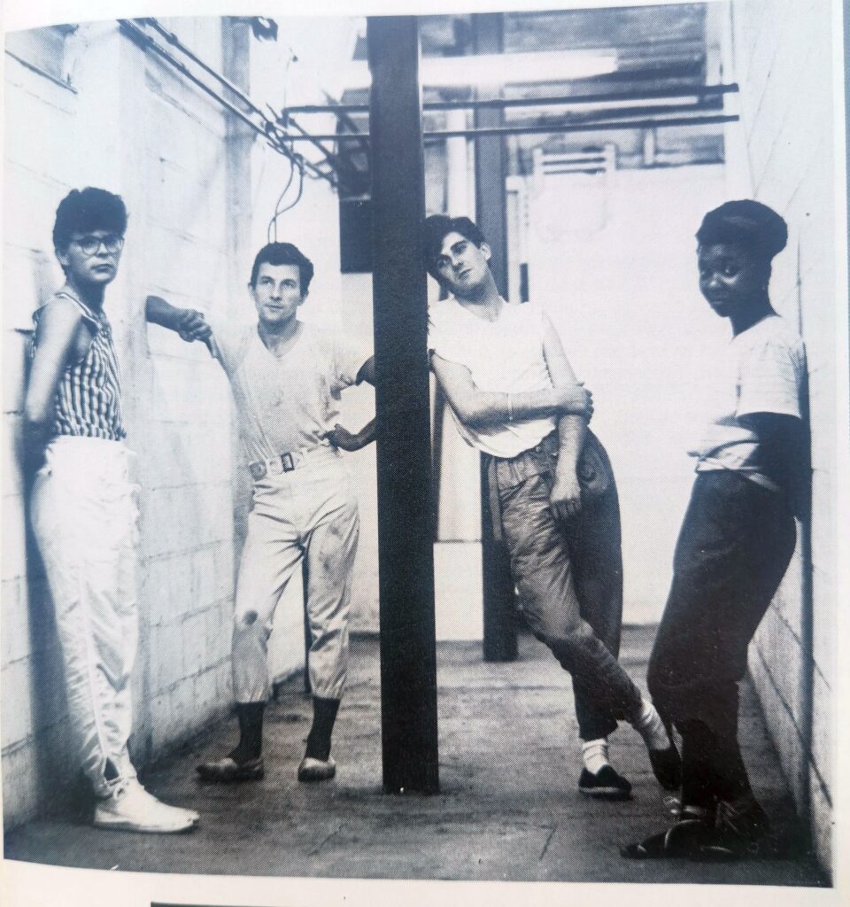
As a case study he looks at photographer Jill Furmanovsky’s role in rebranding the Leicester new-pop band Swinging Laurels as part of an arty bohemian Parisian look, seamlessly slotting into the gamesmanship of the early 80s. The band would have trialled the look at a performance at Nottingham’s Asylum early in 1983. Maybe they hung around in Leicester’s Silver Arcade where the G-Force shop and others were. Pop worlds bleeding through to the everyday terrain.
I used the music newspapers as I cherished the rough texture of the paper – even though I had a stash of glossy magazines (The Face, Smash Hits, Punk! Lives, ZigZag) I did not desecrate these. My A5 diary, also commenced in 1982, was used as a cutting template. If I’d been aware of the conceptualist art movement I could have made a claim here – dual purposing an object to both make art and record art in a synchronised blow.
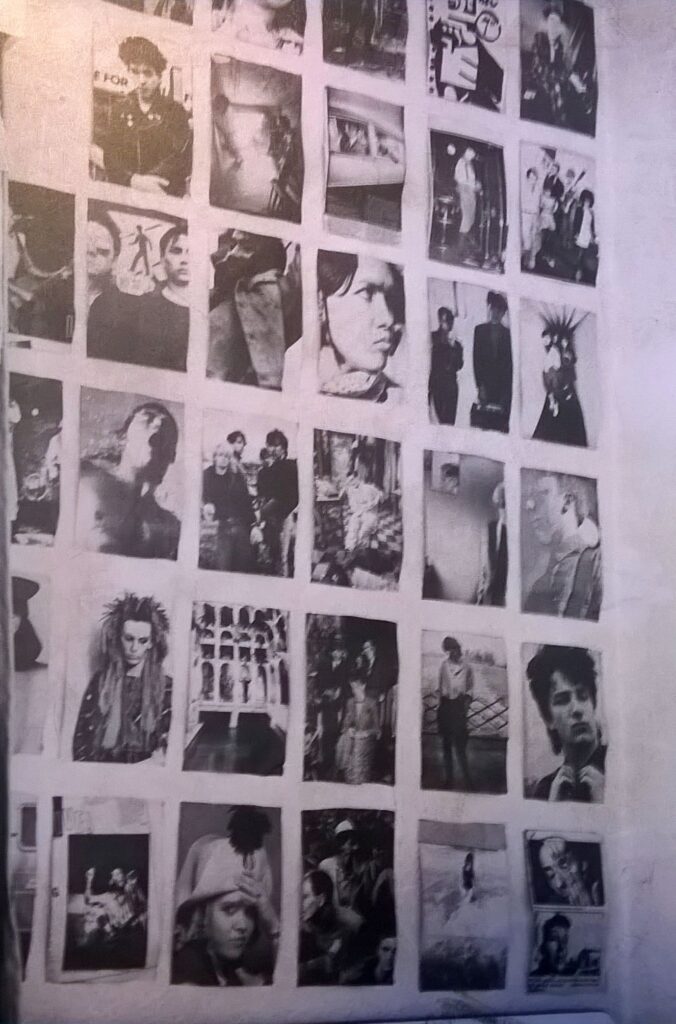
To be feasible and practical the source photograph needed to be at least A5 in size, and if it was larger than A5 (often the case) I had to make a decision as to where to make the cut. It was important that every piece was exactly the same. The selections were then blue-tacked to the wall in a perfect grid that would have made Sol LeWitt sit up and take note. On a minimal number of occasions I would cut a larger photograph with two sections, mounting these on the wall within the grid structure but with a nod to realigning the whole original (even cutting two pieces with a commensurate gap to reflect their intended placing on the grid-wall).
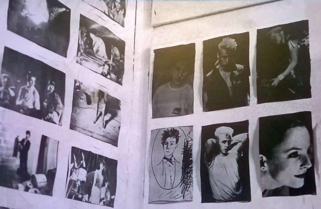
The main wall consisted of landscape cuttings, though the side wall and reverse of the bedroom door accommodated portrait cuttings. The corner of the bedroom contained the airing cupboard which housed the boiler and a stash of towels and bedding. This cupboard was a problem as it legitimised unannounced intrusions into my own private space by other family members to fetch towels and fresh bedding. The pipes around the boiler also banged and knocked on occasions, waking me up in the night. However, the upper and lower doors of this cupboard also succumbed to my plastering with subcultural clippings.
These photographs, these amassed looks, fascinated me. They stared down upon me, I gazed back. They watched over me whilst I slept. All the candidates from my fashion and music obsessions are congealed here as out of focus glimpses in a handful of personal photographs of the space itself – 23 Skidoo, Bow Wow Wow, Robert Smith of The Cure, Theatre of Hate (multiple times), Japan, Bauhaus.
Some images stand out, provoking a memory rush. Cabaret Voltaire standing disconnected from the viewer, staring blankly, one each side of the photograph – displaying typically great haircuts, cropped to the edge of the frame. Rip Rig and Panic clustered around a sunbeam in an attic space. The Polecats (as always) in the back of an American car. Multivision looking left, right and centre decked out in ridiculous Panama hats in a made-up jungle scene akin to a seaside photographer’s studio. David Sylvian, forever on camera, sliced from the frame but repeated in the mirror like a Jeff Wall photographic construction. Robert Görl from DAF, saturated in spray, with the haircut that I hopelessly tried to achieve with a bemused local barber. A Certain Ratio in their cargo shorts, another look I tried to cobble together. Blue Rondo posing in their ridiculous zoot suits and the legendary photograph of fellow new romantic colleagues Animal Nightlife with the band member wearing a leather belted jerkin jacket that I searched to no avail to find in clothes shops.
I hoped their glamour might rub off on me, that I might wake up looking a bit more like Kirk Brandon, or Terry Hall with his post-Specials out of control flat-top (he had it just right with that crimped look at the time of ‘The Telephone Always Rings’), or Scritti Politti’s Green in his bizarre lounging tracksuit and great wedge haircut that veered a little too closely to Lady Di…
Launching in May 1980, The Face traded on the image saturation of new-pop and its crossover to subcultures and slowly mainstreaming new romantic scene. This seminal magazine was quickly followed by i-D (with a street emphasis), Blitz (with an avant-garde fashion emphasis) and then a short-lived publication called New Sounds New Styles which hybridised the other titles. I was 14 years old when The Face launched. I felt it was the magazine for me, even though I was busy going to lots of punk gigs at the time as that was the main fare in Derby. Punk was all but over, and post-punk was taking on myriad forms. The Face, and founder-editor Nick Logan, answered this by call blurring boundaries between style culture, pop culture and post-punk musical experimentation. Logan understood that performance and artifice were re-emerging as a post-punk currency, and he narrated this new sensibility through the pages of The Face. I meticulously kept (and still have) the first 36 issues, in a specially made pair of boxes, with sheets of paper between each issue.
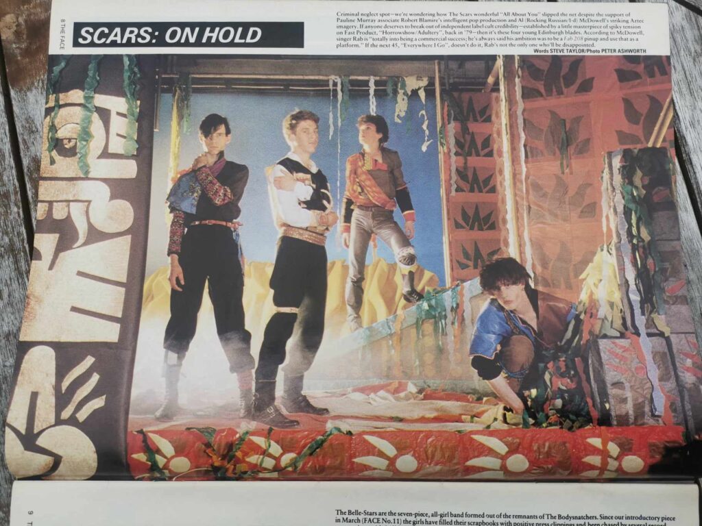
Often inspired by the overnight success of Adam and the Ants, many bands went for the full treatment throughout 1981, getting kitted out in multicoloured clothes, blankets and rags, with random string ties around legs, arms and waists. The Scars were a great band, with a sinister Scots angle of lyrics and vocal enunciation, but they killed their career stone dead by opting for a Spandau-copy look in summer 1981. The Face was often the testing ground for such looks. Stand or fall.
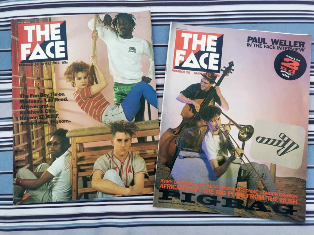
By 1982 image culture was changing from month-to-month at a stroboscopic rate. Following the anything goes excess and silliness of new romantic you had specific looks such as hard times, beachcomber, prairie (sheep-rustler chic), and all sorts of oriental and faux-ethnic styles. There was a run of iconic covers through the spring and summer. To open proceedings we had Fun Boy Three languishing in a school gym with a solitary Bananarama. It was part of many image changes by the band, but by this time Terry’s hair resembles the mushroom cloud that formed the backdrop to their doomy apocalyptic musings. They are followed by a pair of Pigbags, barefoot on the beach, grappling with retro instruments that signify a potentially eclectic funky sound. The trombone player, Simon Underwood, has a more managed version of the Terry Hall mushroom cloud cut, something I always wanted.
Into summer and it’s Nick Heyward representing Haircut 100. A similar vibe of vintage travel, pristine white dungarees, a (designer) seaman sweater, a captain’s hat – like there’s a fey fishing expedition going on somewhere upon a gently rolling ocean with jelly and ice cream. There’s the token thick-knit white hiking socks (all the bands had these) and an early sighting of Converse low-tops. A bit too squeaky clean for me.
Bands were often kitted out with an image before even releasing a record, and would get a box feature in the magazine. A photograph from September 1982 of then-unknown (and, frankly, never known) Scottish band Set the Tone is a case in point. Clearly over-riffing on A Certain Ratio, you have all the punk-funk sartorial ticks: an industrial Hacienda type setting, two looking at the camera while two look away but all have that forced nonchalance, tamed wedge cuts, pedal-pusher trousers in (presumably) white or pastel colours, cap-sleeved or roll-sleeved tee-shirts tucked in to canvas belts, thick sports socks in white squeezed into espadrilles. They have a vibe of trainee teachers trying too hard. Style over substance.
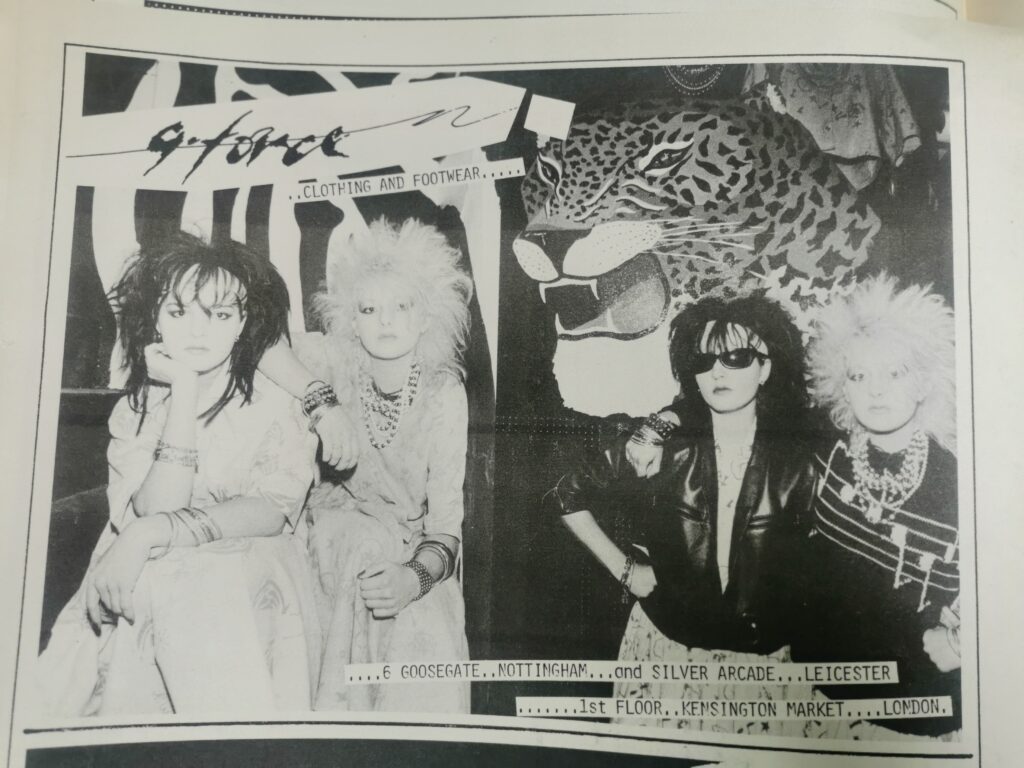
In Nottingham, local fashion had to respond. If we follow the course of G-Force from 1982 – the point when Robin and Jake’s partnership broke apart for Robin to continue solo and for Jake to start The Armory – the churn of themes is astounding. For spring 1982 there is an announcement of ‘Moda Italiano’, their last collaboration, which seemingly didn’t bear fruit. In the summer it is back to the smart rockabilly look with hand-painted leopards by Clare Edwards on leather jackets. Clare goes on to design a set of gothic motifs such as bats and coffins, printed in black and red, and merged into the rockabilly look. This is 1983, when goth was on the rise. By the end of the year an industrial feel is in play, newly inspired by Russian military and workwear. ‘Slugger boots’ and double-belted trousers with rubber sections. This mutates into the ‘Industrial Cowboy’ collection of autumn 1984 – more rubber and PVC, stark monochrome, still a little gothic-rockabilly but glimpsing the new ‘engineers jeans’. And then for 1985 a complete change: bright florals, tablecloth cuts, flowers, damask and scrolls in a languid Moroccan style – perhaps a nod to a similar collection by the emerging London designer John Galliano. Change, change, change.
Nottingham also had an influence on the pop world residing on the fantasy side of the mirror. Ollie and Tony Brack, prior to forming Olto, worked with bespoke couturiers to the 70s scene, and a further Nottingham connection to the new-pop world was made through the Vaughan and Franks label. David Vaughan and Bunty Franks graduated from Trent in 1980 and set up as part of the London post-Blitz scene at Kensington Market. Their clothing was less subcultural and more dressy, attracting a curious crowd – creative and flamboyant. On returning to the East Midlands they opened a shop on Heathcote Street. In both London and Nottingham they struck a chord with the pop world, with various figures such as Feargal Sharkey, ABC, Chrissie Hynde, Marilyn and Bananarama buying distinctive pieces. In many cases they would only discover a pop world customer through a magazine spread or Top of the Pops appearance. As David recalls: “We saw John Moss of Culture Club wearing one our black lamé cowboy shirts on an episode of the A Team”. Pity the fool…
– Ian Trowell